Concept mockups
Round 1 mockups — for context only
The original four mockups, included so anything new can be compared back. These predate the round-3 logos and palette.


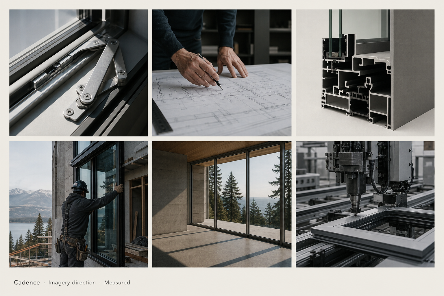
Brand directions v4
Series naming is on hold (Interval pulled), so the lockups now use neutral descriptors like Studio · Montréal, Maison Cadence, or simply the master brand. Six new logo concepts (10–15) and four new palettes (F–I) added — see the Logos and Palette tabs.
We make a small, considered line for architects and builders we know by name. Trade only. No catalog — call the desk.
Request spec packageU-values, air, water, and lead times — published. Trade only. The spec desk in Montréal answers in two business days.
Download spec sheetsWe don't carry everything. We carry what we'd specify ourselves. Read the case studies, then come to the desk.
Read the indexFor projects where the openings matter as much as the walls. Trade only. The spec desk in Montréal, by appointment.
Take an appointmentReply with the world number (01–04). If you like a world but want a different logo or palette, just say e.g. "World 02 but with logo 09".
Logo concepts v5 · 15 + 6 motion variants
01–06 are pure typographic wordmarks. 07–09 are rounded icon marks (favicon-ready). 10–15 are the v4 set: a period mark, an editorial Numéro lockup, beat dots, a serif monogram, an aperture slot, and a diagonal rule with descriptor. New in v5: 10⁺ — six motion variants on Concept 10 (trail dots, beat & bar, open cycle, forward stroke, playhead, caesura), keeping the clean lowercase wordmark you liked and swapping the static period for marks that imply rhythm or forward motion. Series labels have been replaced with neutral placeholders since the Interval name is on hold.
Concept 01 · Lowercase Signature
All-lowercase, weight 400 — confident and quiet
A single lowercase word — like Blanc Marine, but tighter and more architectural. The most confident option: no mark, no caps, no decoration. The brand IS the word.
Concept 02 · Slim Tracked Caps
Light-weight uppercase, very wide tracking — gallery / maison restraint
Light weight (300) with extremely wide letter tracking. Reads as gallery, museum, or fashion maison. Closest to fluid.glass discipline but the lightness keeps it warm. Highest restraint of the typographic six.
Concept 03 · Bilingual Lockup
Cadence + permanent French/English descriptor
The master brand paired with "Maison · Fenêtres et portes · Montréal" as a permanent descriptor. Roots the brand in Montréal and in French/English from the very first impression. No mark — the language IS the mark.
Concept 04 · Editorial Two-line
Cadence (sans) + Studio (italic serif), stacked with a rule
Cadence sits above an italic serif descriptor, separated by a short hairline rule. Easy to swap the descriptor for any future series name. Sans-serif master + italic serif tag creates a literary, magazine feel.
Concept 05 · Italic Serif Accent
Cadence + "le studio · Montréal" in warm italic serif
Cadence sentence case with a Fraunces italic serif tag below. The warmest and most literary of the typographic options — feels like a small studio with a long memory and a bilingual conscience.
Concept 06 · Threshold Mark
Two parallel lines + wordmark
Two short parallel lines — abstract enough to read as a graphic device, not a literal window. A small touch of geometry without committing to a full icon.
Concept 07 · Arch Rounded
Half-circle arch + wordmark — heritage opening abstracted
A Roman/Palladian arch in silhouette — the profile of a Victorian-era window or doorway, common across Montréal. The most heritage of the rounded options. The thin inner arc reads as a transom or fanlight.
Concept 08 · Soft C Rounded
Open-circle monogram — the letter C as a pure shape
An almost-closed circle with a small opening on the right — the letter C, or the idea of "an opening". Most ownable as a standalone icon: favicon, app icon, hardware stamp, social avatar. The friendliest and most modern of the rounded set.
Concept 09 · Window Pill Rounded
Rounded capsule + faint mullion — a horizontal opening, softened
A horizontal pill (capsule) with a faint vertical divider — a contemporary horizontal window or transom seen straight on, with rounded corners. The most architectural of the rounded three, but the corners keep it warm.
Concept 10 · Period Mark New
cadence. — assertive lowercase wordmark with a final period
Lowercase wordmark with a deliberate period. Reads like a finished sentence — declarative, modern, and quiet. The most assertive of the new concepts; the period does all the heavy lifting.
Concept 11 · Numéro Lockup New
№ Cadence — light italic Numéro glyph paired with the master brand
A delicate Numéro glyph in light italic serif precedes the wordmark — like an issue number on a magazine cover, or a stamp on a finished drawing. Editorial, French, archival. Pairs naturally with the Editorial world.
Concept 12 · Beat Dots New
c·a·d·e·n·c·e — letters separated by interpuncts, visualising the cadence itself
The word literally beats. Each letter is held apart by a centred dot — a typographic metronome. Most distinctive of the typographic options without resorting to an icon. Works beautifully on signage and packaging.
Concept 13 · Serif Monogram New
Italic serif C + stacked wordmark — a heritage monogram lockup
A large italic serif C anchors the lockup; the wordmark and a small descriptor stack to its right. Most heritage of the new concepts — a maison crest in modern dress. The C also works as a standalone monogram.
Concept 14 · Aperture Slot New · Rounded
Tall thin rounded slot — a narrow vertical opening abstracted
A single tall slot with rounded ends — a contemporary fixed window seen straight on, or the gap of an aperture. Replaces the visual idea that "Interval" carried, without naming a series. The thinnest of the rounded marks; reads as a notation more than a logo.
Concept 15 · Diagonal Rule New
Cadence ⁄ Studio — slash divider with italic serif descriptor
A thin italic slash between the master brand and a swap-able italic descriptor. Reads as a fraction, an architectural notation, or a magazine running header. Works the same with any future series name in place of "Studio".
Concept 10⁺ · Motion variants v5 · 6 iterations
Same lowercase wordmark — the static period swapped for a small mark that implies forward motion or rhythm
You liked Concept 10's cleanliness but felt the period reads too final for a brand whose name is about movement. Six iterations that keep the exact same quiet wordmark (lowercase, weight 500, tight tracking) and replace the dot with marks that read as a beat, a cycle, a measure, or a progression. Each shown on light and dark for direct comparison. All buildable in pure HTML/CSS — no SVG required.
Concepts 01–06 are pure HTML typography (production set in Suisse Int'l, Söhne, or similar). 07–09 + 14 are scalable SVG — the icons also work as standalone favicons or hardware stamps. 10–15 added in v4. 10⁺ (motion variants 10a–10f) added in v5 — six iterations on Concept 10 that replace the static period with a mark implying beat, cycle, or progression.
Colour systems v4 · F–I added
Four new palettes joined this round (F–I): Bone & Brass, Plaster & Rust, Glacier, and Verdigris. All nine are light-bodied. Pick one as the base; accents from another can be borrowed (e.g. A base + E tobacco accent for headlines, or A base + F brass accent for hardware tags).
A — Warm Neutral
Palette
B — Cool Stone
Palette
C — Atelier Sage
Palette
D — Bleu Blueprint
Palette
E — Tobacco Maison
Palette
F — Bone & Brass New
Palette
G — Plaster & Rust New
Palette
H — Glacier New
Palette
I — Verdigris New
Palette
Reply with one letter (A–I), or two if you want to combine — e.g. "A as base with F brass accent for hardware tags", or "H base with E tobacco accent for headlines".
Typography
The fonts below render live (loaded from Google Fonts). Each pairing changes the temperature of the brand more than any single logo does.
T1 · Inter + Fraunces
Inter does the hard technical work — spec sheets, nav, body. Fraunces adds editorial italics for moments of voice. Versatile and warm. Recommended default — fits Worlds 01 and 04.
Trade only · Spec desk · Montréal
T2 · Inter + IBM Plex Serif
IBM Plex Serif takes display headlines; Inter handles UI and body. Both have engineering DNA. Sharpest and most "spec-desk" of the four. Fits World 02 Specifier.
U-value · Air · Water · Lead time
T3 · Space Grotesk + Fraunces
Space Grotesk has more character than Inter — slightly looser, more contemporary, less corporate. Fraunces brings the magazine accent. Best for World 03 Editorial.
№ 01 · Studio · Issue One
T4 · Inter + Fraunces Light Italic
Same Inter as T1, but the Fraunces drops to weight 300 italic and renders in a warm tobacco accent. Fits World 04 Maison.
Maison Cadence — Fenêtres et portes
Final production typefaces could substitute: Inter → Suisse Int'l or Söhne; Fraunces → Editorial New or GT Alpina; Plex Serif → Söhne Schmal Buch.
Concept mockups
The original four mockups, included so anything new can be compared back. These predate the round-3 logos and palette.
Logo deep dive v6 · new
The breath mark is on. Now we tune it. This panel holds the baseline Caesura (01 lowercase signature + double slash) against thirty-plus deliberate variations across five axes: typeface, slash weight, slash geometry, treatment, and dark tone. The dark tone pills below the hero swap the colour of every dark surface on the page in real time — header, nav lockups, dark cells. Try walnut. The goal is to choose a final pair — one wordmark, one slash — that reads as confident at signature size and unmistakable at favicon size.
Section A
Typeface variations
Slash held constant (1.5px × 17px, -22°, gap 3px). Only the wordmark changes — to see which letter shapes the breath mark sits best beside.
Section B
Slash weight & height
Wordmark held constant (Inter 400 · 34px). Six discrete weights, from a hairline whisper to an architectural slab. The slash is the only thing moving.
Section C
Geometry — angle, count, spacing
Wordmark and weight held constant (Inter 400 · slash 1.5×17). Six geometric studies: angle from vertical to italic, the gap between marks, and the count itself.
Section D
Treatments — colour, glyph, outline
Variations that change the slash material itself: tinted accents, real font glyphs (so it spaces naturally on every line), and a hollow outline version.
Section E
Dark tones — alternatives to black
Eight candidate dark backgrounds, each named for the material it evokes. Click any pill at the top of this tab to apply that tone across the whole page — header, nav lockups, dark cells. Pure ink (current) is the default; walnut and espresso lean warm; anthracite and midnight lean cool; oxblood and forest are the opinionated edges.
Section F
In context — navigation lockups
Six likely finalists at real navigation scale (18px wordmark). The dark lockups react live to the dark tone you select up top — try cycling through walnut, anthracite, midnight to see how each reads on a real nav bar.
Caesura derives from Latin caesūra — a cutting, a pause. In musical and poetic notation it is rendered ‘//’: the breath between phrases. As a brand mark for Cadence (a word that means rhythm), the doubled slash is both a literal punctuation of the wordmark and a thematic echo of the brand name itself. Final decision lives in three coordinates: pick a typeface (Section A), a slash weight (Section B), and a dark tone (Section E). Sections C–D are tuning. Section F is the test.